

In 2026, the concept of “Designing from Scratch” is functionally obsolete for most commercial projects. We have entered the era of Atomic Design Systems, where the value of a designer is not in drawing a button, but in architecting the User Journey. If you are still manually calculating border-radii and hex-code contrasts for every single element, you are losing the race to market.
The “Golden Rule” of 2026 UI design is Component Sovereignty. You should start with a professionally audited, accessible, and responsive “Kit” that handles the foundational elements (Grid, Type, Buttons, Inputs), allowing you to focus on the Innovation Layer of your product.
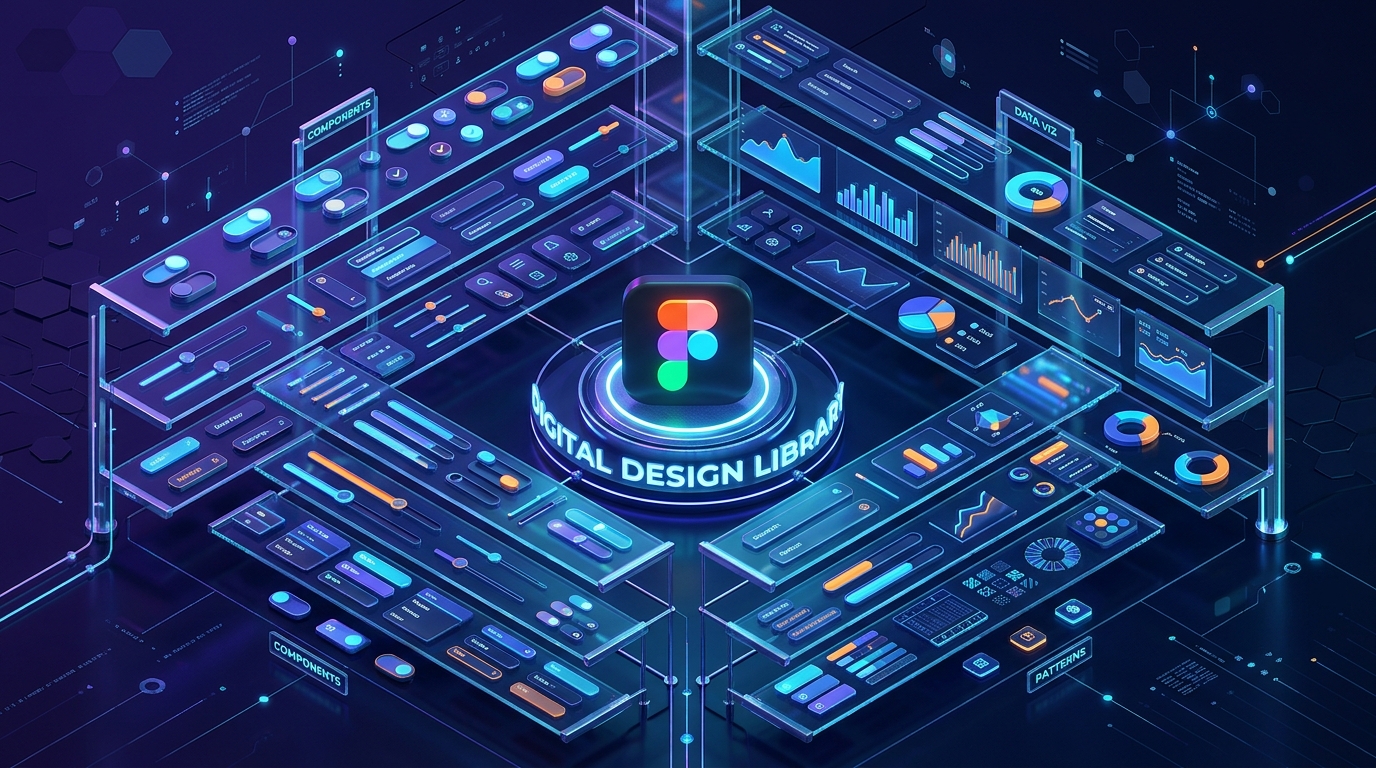
The platforms that dominate 2026 are those that offer Native Figma integration, Auto-Layout 5.0 compatibility, and Variable-ready architectures. This step-by-step guide to the top 5 free UI kit websites of 2026 will show you how to build a world-class interface for $0.
1. Figma Community: The “Source of Truth”
In 2026, the Figma Community is no longer just a “plugin store”; it is the largest repository of collaborative design intelligence in human history. Since most professional UI work happens in Figma, this is the most frictionless place to find your next kit.
- Native “Variable” Support: In 2026, modern kits use Figma Variables for colors, spacing, and rounding. When you download a kit from the community, you can change the entire “Brand Identity” (from Light Mode to Dark Mode, or from Rounded to Sharp) in a single click.
- Auto-Layout 5.0 Optimization: The best free kits here are built with the latest Auto-Layout logic. This means if you change the text inside a button, the button resizes perfectly, and the entire layout shifts to accommodate it. It mimics real-world CSS code.
- Open-Source Design Systems: Many major companies (like Google, Uber, and Shopify) publish their official design systems (Material Design 3, Polaris) for free. Using these kits ensures your app follows the same usability patterns that billions of people already understand.
- Live Creator Feedback: You can see “Remixes” and “Comments.” If a kit has a bug or an outdated component, the community usually flags it or provides a “Fixed” version, ensuring you are always working with high-quality files.
A common mistake to avoid is “Component Bloat.” In 2026, some free kits include 5,000+ components you will never use. This slows down your Figma file. Always “Detach” or delete the pages you don’t need to keep your design performance high.
2. UI8 (Freebies Section): The “Premium Quality” Gateway
UI8 is famous for its high-end, $100+ marketplaces, but their Freebies section is a curated goldmine of “Introductory” kits that are often better than the paid versions of their competitors.
- High-Fidelity “Niche” Kits: While others offer generic buttons, UI8 Freebies often provide specialized kits—like Crypto Dashboards, Meditation App UIs, or E-commerce Checkout Flows. This is a massive time-saver for industry-specific projects.
- Multi-Format Downloads: Most UI8 kits come with files for Figma, Sketch, Adobe XD, and even Framer. In 2026, the ability to move your design into a “Production-Ready” tool like Framer with one click is a significant competitive advantage.
- Iconography & 3D Assets: UI8 often bundles their UI kits with custom icon sets and 3D illustrations. In 2026, “Depth and Texture” are back in style, and having high-quality 3D assets included for free is a rarity.
- Commercial Usage Licenses: Most UI8 freebies come with a “Personal & Commercial” license. This means you can use that “Free Dashboard Kit” for a paying client without worrying about legal repercussions.
3. UpLabs: The “Real-World” Testing Ground
UpLabs is a unique 2026 ecosystem because it acts as a “Competition” platform. Designers upload their best work to win challenges, and the resulting UI kits are often shared for free to build their reputation.
- Interaction-Focused Kits: UpLabs kits often include Micro-interactions and Lottie animations. In 2026, a static UI is a dead UI. Seeing how a drawer should slide or how a “Success” checkmark should animate provides a blueprint for your developers.
- Developer-Ready Assets: Many kits on UpLabs are uploaded by “Design-to-Code” specialists. They often include the CSS/Sass variables or React components alongside the design files, bridging the gap between your Figma file and your GitHub repository.
- Daily Curated Collections: The UpLabs team curates “Top 10” lists for specific categories (e.g., “Top 10 Login Screens”). For a designer in a creative rut, these collections act as a “Mood Board” and a “Starter Kit” all in one.
- Material Design Specialists: If you are building for Android, UpLabs has the most extensive collection of Material You (MD3) kits that follow Google’s strict accessibility and elevation guidelines.
4. LS Graphics: The “Visual Presentation” Master
If you are a freelancer who needs to “Wow” a client during a presentation, LS Graphics is your 2026 MVP. They specialize in UI kits that are optimized for Mockups and Portfolios.
- The “Hero” Sections: LS Graphics freebies focus on the “Money Shots”—the landing page headers and product feature sections that convince a user to scroll. These are designed with high-impact typography and perfect whitespace.
- Device Mockup Integration: They provide kits that are “Ready-to-Place” into 3D iPhone or MacBook mockups. In 2026, showing your design on a realistic device is the only way to get “Stakeholder Approval” in the first meeting.
- Clean, Minimalist Aesthetics: Their design language is heavily influenced by the “Minimalist/Scandinavian” trend of 2026. If you are building a premium “Fintech” app or a high-end “SaaS” platform, their kits provide the perfect “Quiet Luxury” feel.
- High-Resolution Textures: Unlike generic kits, LS Graphics often uses custom grain, glass, and mesh-gradient backgrounds that give the UI a “Tactile” feel that is very popular in 2026.
5. UI Store: The “Aggregator” of the Best
In 2026, UI Store (uistore.design) acts as the “Google for UI Kits.” They don’t host all the kits themselves; instead, they crawl the web to find the absolute best free resources from independent designers across the globe.
- Unbiased Curation: Because they are an aggregator, they aren’t trying to sell you their own “Pro” version. They just link to the best stuff on Dribbble, Behance, and personal portfolios.
- “Design System” Focus: They have a dedicated category for full Design Systems. In 2026, you don’t just want “Screens”; you want a “System.” UI Store helps you find the large-scale frameworks that include “Style Guides” and “Documentation.”
- Trend Filtering: You can filter by current 2026 trends—like Glassmorphism, Neumorphism, or Bento Grid layouts. This ensures your project doesn’t look like it was designed in 2022.
- Direct Download Links: They strip away the “Marketing Fluff.” You see a kit you like, you click, and you are usually one click away from the Figma file. It is the most efficient “Discovery” tool for a busy developer.
Comparison: Which 2026 UI Kit Site Matches Your Workflow?
| Platform | Best For | Technical Strength | File Formats |
| Figma Community | Collaborative Devs | Variables & Auto-Layout | Figma (Native) |
| UI8 | Niche Products | High-Fidelity Assets | Figma, Sketch, XD |
| UpLabs | Interactions | Micro-animations / MD3 | Figma, CSS, React |
| LS Graphics | Presentations | Mockups & High-Impact | Figma, PSD |
| UI Store | Discovery | Broad Aggregation | Multi-Format |
The 2026 “System-First” Strategy: 3 Steps to a Perfect App
A UI Kit is a tool, not a template. To ensure your 2026 app doesn’t look like a “Copy-Paste” job, follow the “Analyze-Adapt-Audit” protocol:
- Phase 1: The “Inventory” Audit (Figma): Once you download a kit (like one from the Figma Community), look at the “Local Styles.” Do the text sizes follow a logical scale? Is the “Primary Color” accessible for color-blind users? In 2026, Inclusivity is a feature, not an afterthought.
- Phase 2: The “Brand Adaptation” (Variables): Use Figma’s Variables to replace the kit’s colors with your brand’s colors. If the kit uses a 4px grid and your brand uses an 8px grid, update the “Spacing” variables. This “Global Update” ensures the kit now “belongs” to your brand.
- Phase 3: The “UX Logic” (Auto-Layout): Test the components. Drag them into your wireframes. If a “Card” component breaks when you add a long headline, fix the Auto-Layout settings. In 2026, a “Broken Component” in design leads to a “Broken Component” in GitHub.
Final Thoughts
In 2026, your UI Kit is the “Infrastructure of Imagination.” It provides the boring, structural parts of the web so you can spend your energy on the User Experience and the Core Innovation of your brand.
By leveraging the “Community Intelligence” of Figma, the “Premium Assets” of UI8, or the “Interactive Depth” of UpLabs, you are building a professional-grade product for $0. The components are ready. The variables are set. Your only job now is to Design the Future.


Leave feedback about this